Let me open with a punch: 90% of the campaigns I audit lose money because of a button. Yes, a button. That little thing nobody looks at because everyone’s obsessed with ROAS, CTR and whatever algorithm update just dropped. And here’s the truth: optimizing your landing page button is what separates a profitable campaign from a budget black hole.
Sounds familiar, right? Keep reading, because this one’s about you.
I’ve spent years in Paid Media. I’ve watched entire teams break their backs tuning audiences, bids and creatives, only for the user to land on a page and hit a gray, lost button with text like “Submit.” Submit. Submit what? Where? Why would I want to submit anything?
Your landing page button isn’t a detail, it’s the line between the click and the sale
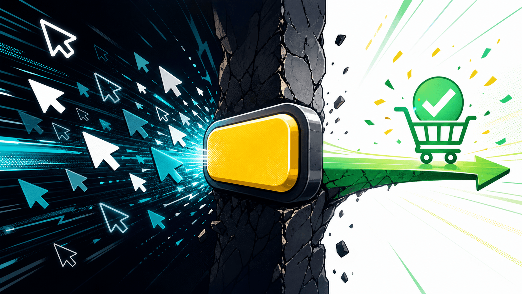
Here’s the brutal part: you pay for every click. Every single one. Google Ads gives nothing away. The moment someone taps your ad, the money’s already gone. What happens next is the only thing that decides whether the campaign turns a profit or becomes a bottomless pit.
And the button is that moment. The exact instant the user decides whether to hand over their money, their email or their time. Or to walk. The usability studies from the Nielsen Norman Group have been proving the same thing for years: the clarity of the action element weighs more on the decision than the rest of the page.
Think about it. The hard part was already done:
- You segmented like a surgeon
- You wrote copy that stopped the scroll
- You tweaked bids into the small hours
- You built a decent landing page
And all that effort comes down to one little colored box. The funny part: it’s exactly the piece almost nobody seriously tests.
Why your button is a dud (and it’s not your fault)
The root problem is cultural. As an industry, we’ve decided that the “important” stuff is the complex stuff: attribution, conversion modeling, AI-driven bid automation. The sexy stuff. The stuff that looks great on a slide. If that side of things interests you, I covered where it’s heading in Smart Bidding 2026: Google Ads’ big shift.
A button, on the other hand, seems too simple to deserve attention. And that contempt for the simple is exactly what sinks us.
I’ll say it straight: I’d take a team obsessed with making the button say “Get my free quote” instead of “Submit” over one that’s memorized all 47 keyword match types and leaves conversion to luck.
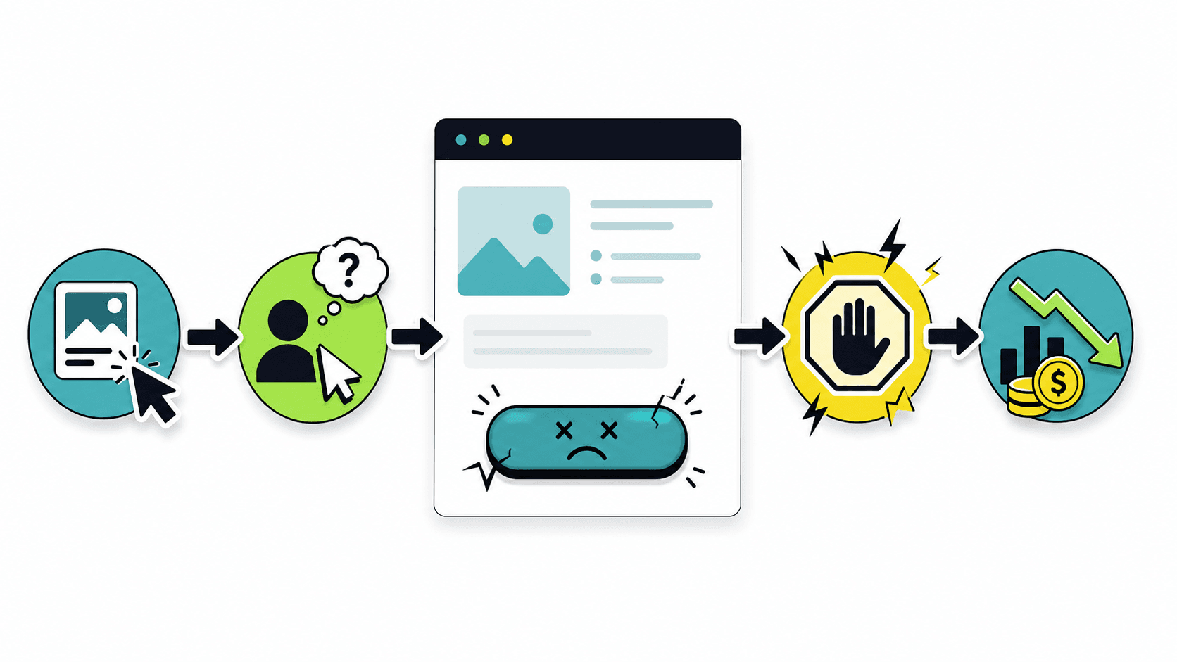
The user doesn’t think like you. They don’t care about your funnel. They haven’t read your media plan. They see a button and ask themselves, in milliseconds: “what do I get by clicking here?” If your button doesn’t answer that, you’ve lost them.
Three things a good button always does
There’s no magic formula, so I won’t sell you one. But there are patterns that hit far more often than they miss:
- Speak in the first person and in terms of benefit. “I want to save money” converts better than “Request information.” The user projects themselves into the action.
- Actually contrast. If your button blends into the background for the sake of “brand consistency,” congratulations: you’ve put design ahead of money.
- Kill the fear. A line of microcopy underneath” No strings attached,” “We reply within 24h” removes friction at the moment of truth.
Obvious stuff, right? Then go check five of your competitors’ landing pages and count how many get it right. I’ll wait. If you want the data, Unbounce’s Conversion Benchmark Report makes it clear how much form friction costs you.
AI won’t optimize your landing page button for you
And here comes the usual line: “Dani, but AI already handles this on its own.” No, it doesn’t.
AI is incredible for scaling what works. For spinning up variations, testing at volume, spotting patterns you can’t see. Genuinely useful. But it doesn’t understand your customer. It doesn’t know your audience distrusts long forms because they’ve been spammed a thousand times. It’s missing the human context.
The judgment is still yours. AI throws twenty button versions at you; you pick the one that makes sense for THAT business, THAT customer, THAT moment. Delegating that decision blind is the temptation that’s wrecking what used to work: optimizing everything until you’ve stripped the judgment out of it. I made that case more calmly in why a self-improving system needs human approval and in how to automate content with AI without babysitting every step.
Automation, yes. Blind automation, no chance.
The test to optimize your landing page button this week
Here’s your homework, because theory without action is worthless.
Take your worst-converting campaign. The one that drives you nuts. Don’t touch the bids, the audiences, anything on the Google Ads side. Change only the landing page button: the text, the color, and a line of microcopy that takes away the fear.
Let it run for a week with enough traffic. Then look at the numbers.
I’ll bet you anything that you move the needle more with that five-minute change than with the last three weeks of “advanced optimization.” And if not, write to me and tell me, because that’s how I learn too.
In the end this comes down to the same old thing: stop staring at the complicated and fix the obvious. The industry fell in love with its own complexity and forgot that the money comes in through a button. That’s why optimizing your landing page button is the most profitable lever you have right now.
So there you go. Next time a campaign underperforms, before you blame the algorithm, check the button. The problem might have been sitting right under your nose for weeks.
PS: If you finish this, head to your site, and discover your main button says “Submit”… relax, you’re not the only one. But fix it today, go on.